Showing posts with label hand lettering. Show all posts

Tuesday, May 28, 2013

L&H for Paperless Post: Baby!


I've added some new designs to my baby collection over at Paperless Post and have posted some here. I used india ink as the starting point for all of these designs. I love the quick brushstroke look - and putting many of the same images together really makes it sing for me. Except for the 1st Birthday design at the bottom - that one to me looks simple and awesome as is. Plus, a first birthday really is a big one

All of my baby designs for PP are available as e-greetings as well as paper. You can check them out here. Hope you like! And let me know if you use one or receive one - I'd love to hear what you think!


Wednesday, January 30, 2013

Wayfare Magazine


I was honored to be asked to do a hand lettering piece for the debut issue of Wayfare Magazine - a beautiful new publication "celebrating the art of the journey." The photos & layouts in here are amazing  & inspiring - like a little vacation for the eyes & for me, a reminder to go see & explore. We're thinking of taking a trip - toddler & newborn in tow - sometime soon. Hard not to feel the urge to get out, to get away, to see something new (and preferably in the sunshine) when January in NYC rolls around. Here's a little peek inside the Wayfare issue. See more on their website here.


Tuesday, November 13, 2012

Print Aid NYC


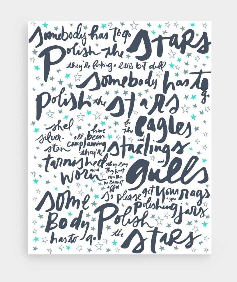
I was asked to do a poster design for Print Aid NYC - a fundraising effort put together by artists committed to helping their neighbors & rebuilding their city. All proceeds go to the Mayor's Fund for Hurricane Relief, of which 100% of donations is dispersed to city relief efforts and organizations for food, water and hygiene supplies, as well as long-term relief and restoration efforts.

The theme for the posters is "light." I chose to handletter the poem Somebody Has To by Shel Silverstein with a brush & ink and had it whirl around the page among scratchy stars. It's a bit of an interpretation of light, but polishing stars with polishing jars and rags seemed to fit just right. 

You can see & purchase my poster here. ($30; limited edition of 50)

To see all current poster designs & learn more, visit Print Aid NYC here.

Wednesday, March 7, 2012

Repetition


I have been looking at a lot of quilts & quilting patterns lately, in preparation for a new project I'm launching at this year's Stationery Show. (Stay tuned for more on that!) I've always loved the way the quilt pattern repeats itself with those subtle variations that result only in something handmade.

I recently hand-lettered a friend's birthday menu. To find out what style of lettering she wanted, I wrote out the same cheese name & description in different styles and found the result to be that same lovely repetition-plus-variation I'm drawn to in quilts.

Cheese and quilts - who knew?

Wednesday, January 4, 2012

Three New Works

I haven't made art for art's sake in a very long time. I always have a reason to create something - and usually a deadline. Until Minted unveiled its newest challenge a few weeks ago: the art print challenge. One of the big reasons I've joined Minted (where you submit designs to be chosen by the community) is to dive into & test new work without a lot of strings attached. No pressure to produce or price or market, let alone store inventory to pack & ship. Minted announces challenges pretty regularly, so I can choose to submit or not, depending on my schedule & interest.

This new challenge called for art that we'd hang on our own walls, that we'd want ourselves. I had been toying with a couple ideas in my head & this was a good way to 1) get them out of my head & onto paper and 2) possibly like the process & result so much that I'd be motivated/reassured to keep at it.

While I had more ideas for submissions, I decided to stick with three that worked well together & that meant a lot to me. In order of appearance, we have: Sea Fever, You are my Rising Sunshine, and Little Prince.

Sea Fever is a poem by John Masefield and was read by my sister at my dad's memorial service last month. I wanted to display this poem in my home, but wanted to hang or frame more than just a print out of the words. Done in this way, I can choose to read the words on one day and choose to just see the beautiful ship on the next - depending on how close I want to be.

You are probably very familiar with the folk song You are my Sunshine. My mom sang it to us when we were little and today, it is almost synonymous with her memory. In my print, You are my Rising Sunshine, I had originally oriented this at the bottom of the canvas, and then realized that it looked like it was setting and that the sunshine had indeed been taken away. So I moved it to the center where it becomes more of a rising sun - a beginning to beauty, not an end.

And finally, my last piece, Little Prince - words taken from the beloved children's book of the same name & words that came from a friend & have helped me through loss. I experimented with a star shape & it felt too literal. So I tried a circle, which given a circle's nature of never ending, seemed like a better fit. And as someone who'd put this on a wall, I like that close-distant relationship similar to the one in Sea Fever. You can read the words, but because they go up-side-down at times, you are almost forced to just see a circle of pretty lettering.

So those are my three submissions for Minted's art print challenge. What do you think? The challenge is now open to voting, so if you like them, check them out here and scroll down to Linda & Harriett to see & vote.

Thanks for letting me share these pieces and their meanings here. I realize that they're a little heavier than most of the submissions on Minted, but I sort of can't help it. It's a little bit of where I am right now in processing my dad's passing and a little bit selfish, I guess, too - because I would (and will) be hanging these on my walls. And I know I've been out of the game for a while, but isn't art supposed to be personal?

Tuesday, September 1, 2009

Julia Rothman: Forks print


You may have seen this print by Julia Rothman on design*sponge the other week. I am a big big Julia fan so I was excited to get her tweet that the print is now up in her shop - $18 & includes shipping. No brainer. It's an edition of 50, so get going!

[image courtesy of Julia Rothman]

Friday, February 20, 2009

Handwriting & Handwritten Notes


There's a great excerpt from Kitty Burns Florey's new book Script & Scribble, The Rise and Fall of Handwriting right here in the WSJ. While it's not the same thing exactly, I was recently interviewed about the resurgence of letter writing in an email age. I love this topic and could talk about it til the cows come home. I have a friend who is the queen of letter-writing - thank you notes for everything from gifts to the casual hosting of a home-cooked meal. And I have to say, there is nothing nicer, and perhaps more pleasantly surprising these days, than a sincere handwritten note. A simple thank you, a hello, an I miss you. I love them all - personalized stationery or a greeting card - it doesn't matter as long as it's you.

Friday, January 30, 2009

Handlettering


I've been doing a lot of hand lettering this week - trying to find a place for it in our new product line rolling out for the NSS.

Pics from our new space coming next week. Have a great weekend!

Tuesday, January 27, 2009

WSJ: Handwriting


Our office is still in transition mode and I can't bear to show "before" pictures without showing "after" ones, so I'm moving on for now. Forgive me.

One of my little business resolutions is to post more regular content on this blog. And one of the things I thought about was a regular Wall Street Journal post. I know that may seem odd and off-topic at first - but hear me out. I started reading the Wall Street Journal after taking a business class where we discussed current small business articles and was surprised to find all these little gems (the best wine column I've ever read) in a paper I thought was quite frankly boring. And since I don't read it every day but really should since I subscribe - I thought this would be a good way to keep it in my life - and bring it (or introduce it) to yours.

So, I thought I'd kick it off with an article from this past WSJ, Weekend Edition about handwriting - written by Cullen Murphy, Editor at Large of Vanity Fair. Click here to read.

Image above from one of my favorite calligraphers, Jenna Hein.